Showing posts with label Fine Art. Show all posts

Tuesday, October 13, 2009

Introducing: Budget Italian Power Metal

A gregarious bunch of leather daddies or a budget Italian power metal band? You decide!


I know that making fun of Italian metal is easy. It's like when the two inbred main characters have sex with the retarded girl in Gummo. It's almost too easy, but I just can't help myself. See, a while back the Sarge introduced us to the world of budget slam metal, perhaps best exemplified by Artery Eruption, and now I'd like to introduce you to the kings of budget Italian power metal--Kaledon. These Roman warriors have displayed an undying allegiance to all things lo-fi and low-budget that has left them unchallenged atop the steaming pile of shit that is budget Italian power metal.


Here we see the crowd (all two of them) going wild as Kaledon performs their smash hit "Spirit of the Dragon." A force of nature, Kaledon is best experienced live as the sheer sonic force of their performances have been credited with causing at least a half dozen suicides across the Lazio region.


This reminds me of the kind of picture I would expect to see hanging up in the dining room of any number of my Italian family members. You see Italian dining rooms are not actually meant for dining, they're more for show. That's where you display all the wonderful useless shit you got at your wedding 30 years ago like your gigantic china closet filled with fine china you never use--you know, the good stuff--along with your crystal and your special silverware (the kind that's actually made of silver). You'll usually also find an enormous dining table covered in a gawdy white lace tablecloth some grandmother spent a lifetime making. If your Italian family is anything like mine then the dining table chairs are probably hermetically sealed in plastic and will never be exposed to the elements. And no matter how big of a loser he may be, an Italian mother will always be proud of her son because he is her pride and joy and so she will have several photo albums worth of embarassing pictures of him and she will gladly display a picture from his first communion right next to the picture he took with his friends out near the Roman Aqueduct while dressed like a gang of child molesting Renaissance fairies in a gigantic gold plated frame. Mama is especially proud of that 12 inch boner you're smuggling in your leather pants.


More often than not "serious musicians" are all business, but not the ragazzi of Kaledon! It's refreshing to see that the boys can just as easily spend a day relaxing in the studio, joking around and having a good time instead of spending hours carefully trimming their facial hair while their little sister repeatedly bangs on the bathroom door because she has to pee and dad yells to finish jerking off and get out of the bathroom because he has to take a shit.

One thing you could never accuse Kaledon of doing is progressing. Just look at the cover of their debut album, Legend of the Forgotten Reign - Chapter 1: The Destruction.


Now take a look at the cover of their most recent album, 2008's Legend of the Forgotten Reign - Chapter 5: A New Era Begins.


From the unforgettable amateur paintbrush to the utterly forgettable amateur computer illustration, Kaledon is never content to rest on their laurels. They've never let their complete and utter lack of talent stop them before so why start now?

I'd like to leave you with what I think is the most compelling piece of evidence in the case for Kaledon's budget Italian power metal supremacy--the music video for their hit single "The New Kingdom." I could spend days tearing apart every frame, but instead let me just point out how proud they are of their packages as we once again see a band member proudly displaying his manhood in his way-too-tight white linen pants. It's impossible not to notice the tremendously low production values of this video, but it's obvious that the men of Kaledon make up for what they lack financially with their boundless enthusiasm for their horrible music. It's hard not to admire that kind of dedication. Against all odds and good sense, Kaledon endures and to that I must say--forza, Kaledon!


As an added bonus for our Italian speaking readers enjoy this equally retarded parody video:

Friday, July 3, 2009

Vomit Grinder: A master and his craft

Someone call the authorities! That poor child is not only being forced to wear track pants at an early age, she's also being subjected to seventh-rate pornogrind created by a man who wears pants so large they would have been mocked at a rave in 1995.


Man, you blink for only 20 years or so, and the entire pornogrind scene changes drastically. Back in my day, Traci Lords Loves Noise and early Meat Shits defined the sound of a musical movement that seemed unstoppable. Young upstarts, like Illinois' own Vaginal Dissection were making significant contributions through their endless flow of cassette releases.

Today, things have changed, and one primary outlet for this musical style is the medium known as the YouTube. All I have to say is, thank god for the YouTube. Today thanks to technology and the internet, we are brought inside the inner circle of pornogrind masters like Vomit Grinder, artists of the highest order who previously performed their craft in relative obscurity. No more. How many of us have said "Oh to have been a fly on the wall when Mozart wrote his Clarinet Concerto", I know I certainly have. Such longing is no longer warranted. Simply watch the videos below, and enjoy a rare insider's look at an artist and his craft.

Please note the tasteful decor which surrounds this musical genius as he works on his musical masterpieces. It appears as though he went to the Funeral Home Decoration Depot and simply said "I'll take it all". While the decor may not be groundbreaking to other trailer owners, the rest of us are left in an emotional state upon seeing such beauty. Like a fat American tourist who sees Versailles for the first time, it becomes clear that while such opulence is common for those who live in it, the rest of us are simply looking from the outside in.

Enjoy his oversized pants, his huge amp, and please note his creative solution for not having a mic stand. Oh, and one last thing, look closely in the second video, as you will surely see the muses that inspire this creative genius.


Friday, June 26, 2009

From Spain with love (Part 2)


In case you missed the first part of this post, you should know that two of Metal Inquistion's finest writers are going to Spain and Andorra, not to see some horrible metal festival, but to see the Tour De France as it makes it's way through those two countries. In celebration, we will now take a closer look at Spain's offerings and culture in the realm of metal.


__________________________________________________________________

Sometimes, even kvlt black metal dudes have to put grimness aside and say "ehhh...fuck it, I need to get laid"


__________________________________________________________________

When I see this picture, all I can think about is the fact that his mother still lovingly washes the skid marks out of his underwear.


__________________________________________________________________

Many bands from Spain are merely fifth rate rip offs of more established shit bands. Want proof? Just look at Spanish shit-music pioneers Nu. Have you ever had the unfortunate luck of listening to Jethro Tull? If you have, then you've also heard these guys. Spanish lesson for today: How to say "the flute is the most phallic instrument ever, and all those who play the flute were probably molested as children", repeat after me class "La flauta es el instrumento mas falico del mundo, y todos los que tocan la flauta probablemente fueron abusados sexualmente cuando eran niƱos."


__________________________________________________________________

This particular black metal band from Spain is really not trying hard enough. Just look at their ill-conceived stage props. Who could possibly hang themselves from a noose that is two feet off the floor?


__________________________________________________________________


I can just imagine the email that the band members sent the "artist" who drew this cover. Once translated into English, it went a little something like this: "So the logo will totally be made of steel, and should have rivets! Don't forget the rivets, they are very important. From the logo, lightning should come down, and be hitting both the statue that we mentioned in our last email, but also the human heart that the guy will be holding on his right hand. Oh and by the way, please make sure that the guy holding the heart looks exactly like Dog The Bounty Hunter, and please make sure that his hands are permanently locked in an action figure-like kung-fu grip.


__________________________________________________________________


I don't know which part to laugh at first, the perspective or the misshaped roulette wheel. Having said that, I have to say that I admire the artists' ability to render the creases in both fabrics and leather. This guy must have been trained by artistic master who gave the world the sublime rendering of drapes on the cover of Death Angel's Act III


__________________________________________________________________

If your mom asks you to go cut down some of the weeds in the back yard, don't take it as a worthless chore. If you are truly committed to being grim, you should see it as an opportunity to be grim as fuck.


__________________________________________________________________


In an attempt to bring Spain into this century, the police have been rounding up metal douchebags on a daily basis, and sterilizing them in order to prevent them from breeding. Although some are protesting that these round-ups reek of Franco-era tactics, I see them as being both unimportant, and unnecessary. Why spend tax payer's money sterilizing these individuals, when their denim vests already act as a kryptonite-like deterrant against all females?


__________________________________________________________________


Vests in general are very useful. A life vest keeps you from drowning. A bullet proof vest keeps bullets away. A denim vest keeps women away.

Come on, you saw the joke coming from a mile away...but you still laughed. Admit it.

Wednesday, May 27, 2009

The Metal Inquisition Archives: Pencil renderings of metal bands (Part 1)


This is the first post (I mean "piece") in what will probably be a long series of posts about the contents of the recently found Metal Inquisition Archives. Much like a time capsule that was left behind for decades, the Metal Inquisition Archives feature incredibly telling artifacts from the lifelong commitment to metal that my brother and I have shared. A bit like our ongoing Metal Archeology series, this one will focus on the contents of a single storage bin that was recently unearthed. For many years, most of the contents of the archives were kept secret, partially due to having forgotten about them...but also as a result of my sheer embarrassment of its contents. Some years ago, in an attempt to make Sergeant D laugh, my brother and I shared some key pieces from this collection, and laugh he did. To this day, there are still a few things about the collection that he continues to bring up in order to make himself laugh. We hope you have a similar reaction. So why share this stuff with the world, when we've been hiding it for years? I have no idea. Perhaps I think of our readers as our family. No, that's probably not it at all. I guess I'm just an all-around good guy and want to share the wealth with the world. Either that, or I'm self destructive and hate myself, who knows. Let's get started.

What are these things?
The items I'm sharing with you today are some one of the key pieces of the collection. Both the Smithsonian and the Getty have been after these for sometime, but we turned down offers that totaled dozens of dollars, so that we may share these with you, our readers. You see, these are just some of the amazing drawings that my brother and I created back in 1988 and 1989, although some are as recent as 1991. As you will see, the artistic skills shown in these pieces of art are only rivaled by our lack of understanding of the English language. Sadly, Blogger is not great at showing large images...but don't worry, at the end of this series I'll provide a link so you can download a hi-res PDF of these pieces, which are suitable for framing (Thomas Kinkade, eat your heart out). In the meantime, double click the images, and enjoy them at a much larger size.

Why were these horrible "masterpieces" drawn in the first place?
I don't have a great answer to this question. My brother and I were not exactly loners growing up, but the huge stack of drawings in front of me seems to tell another story. We had friends, enjoyed sports, and took public transportation all over the city where we grew up. We weren't sickly or awkward (at least not too awkward), but I guess we also liked staying at home and drawing away. We were always obsessive as kids, and when metal became a part of our lives, we dove in head first. In South America back then, the chance of ever seeing a live metal band was slim at best. The opportunity of ever seeing a world-class band, or even a fifth-rate thrash band (I'm looking at you Laaz Rockit) was non-existent. Similarly, we had no access to magazines or even metal albums. All of our tapes were tenth generation dubs with no covers, and perhaps as a result of this isolation, our minds were left to wander. Sometimes, we would see a tiny bit of a band's video at a friend's house, and our minds were blown to the point of having to draw the image that had been burned into our minds. Looking at many of these drawings, I'm taken back to that time, and can easily place why certain things are in these drawings, such was the impact that imagery within the realm of metal had on me. It's for this reason that I often feel that those of us who grew up in seemingly distant and secluded nations had a greater bond to metal and other subcultures. This is not something I'm particularly interested in debating, as I'm certain I could be proved wrong, but when I think back to just how insanely obsessive we were about metal, I'm often left to think that it was more about our surroundings than our personalities. Like a religious fanatic who praises the unknown, metal seemed like a distant heavenly thing, and we worhsiped at the altar of metal.

How/when were these masterpieces drawn?
The majority of these pieces were done by me (each one signed and dated on the back), with a few being done by my brother as well. A few were done as collaborations since my brother was way better at drawing hair (especially mid-headbang), and I was better at drawing drumsets. You see, I badly wanted a set of drums, and my brother wanted a bass guitar. Although we lived in an extremely populous city, there was only one instrument shop in the whole city. We had never been there, as it was well over an hour away...so we also fetishized musical instruments as much as we did bands and metal in general. I'm not exaggerating when I tell you that the first time I ever saw a set of drums in person, I nearly fainted. I was so excited that I simply couldn't contain myself. Again, this speaks to the level of isolation that we lived in. Still, it was a great childhood, and many of those positive memories took place at my desk, drawing these amazing pieces of art. My bedroom was next door to the family room, in which my father's Sony stereo system sat. Since I didn't have a stereo in my room, my brother and I took one of the oversized speakers (one of those huge ones with the fake wood veneer), and put it in my room so we could listen to music. In order to play a tape, we would have to go into the other room, start up the tape, and then go back into my room to listen to the right channel only, since we only had the one speaker in the room. To this day, there are certain Slayer and Venom songs that sound weird to me as a result of now being able to hear both channels. From time to time, we would play radio DJ for one another, plugging a set of headphones in the other room and using them as a mic. "And up next is a killer track from Slayer", we would say into the set of headphones, trying to entertain one another as we drew for hours. My brother was particularly good at it, taking care to mix music behind his talking, a skill that would come in handy years later when he hosted his own metal radio show for about four years. Keep in mind that I was 10-11 at the time. I'm not saying my age makes it any less embarrassing, but I'm hoping it puts things into context for you.

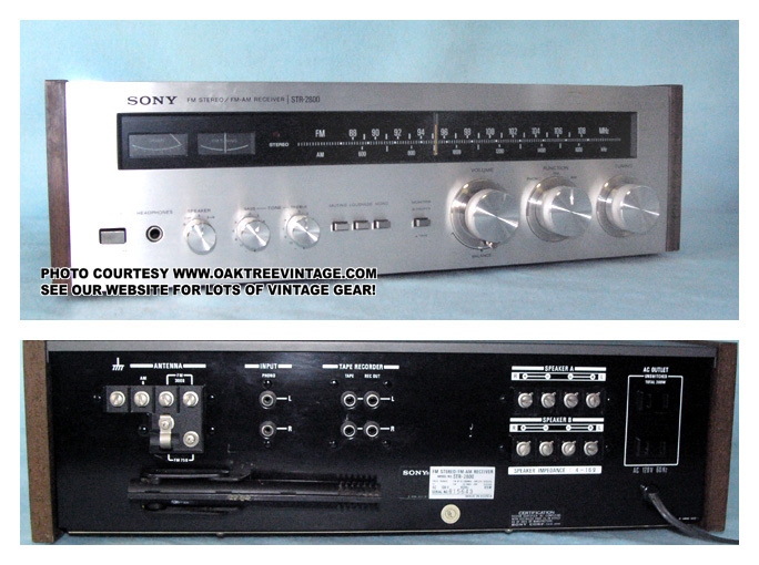
It was through that old, piece of doo-doo Sony stereo that we would make dubs from our friend's tapes. The stereo, I should tell you, did not have two cassette decks, oh no. The way we copied tapes was by playing the cassette on my dad's stereo, and placing a small boombox by the speaker, which recorded the sound from the stereo. We surrounded the speaker and the boombox with pillows, and made sure not to talk or make any noise during the full duration of the dubbing session. Now that you have a clearer picture of when a 10-11 year old version of me worked on these drawings, you can enjoy them that much more.


The masterpieces


Let's just get this one out of the way right now. I know it's Mr Sergeant D's favorite, so this one's for him. Why on earth I shared this drawing with him many years ago, I'll never know...and why I'm posting these for all of you to laugh at me is also beyond me. First things first: yes, his shirt and the sticker on the guitar say:

Welcome to the hell

Did I warn you about my lack of English skills back then? I was 10 for god's sake, and all the English I knew was from Slayer songs and Eddie Murphy movies. This piece is unusual, in that it only depicts one member of a band, in this case the band is E.S.S., a made up crossover type band. When I say "crossover", I don't mean like DRI circa "Dealing With It". That would be way too cool. I mean, more like how Anthrax thought they were crossover by virtue of merely using the NYHC symbol on their guitars, and by having posed twice with a Variflex skateboard for a picture in RIP magazine. The band's name being three letters was a cue I took from bands that seemed to play har(d)core or punk, although I had never heard most of them. DRI, GBH, SOD, MOD...they all seemed the same to me. Again, I can't explain enough how detached I was from music and reality at large. Why his fretboard says "harcore", I'll never know. First of all (as a reader pointed out) it's missing a "d". But see.... I guess, he loved har(d)core music and wanted to let his fans know. Hey, no one gave James Hetfield any guff when he put that man/wolf design on his fretboard...so go take it up with him. The same is true for the backwards baseball hat, which I (for some odd reason) thought was a sign of being "har(d)core", and crossover. No one where I lived wore hats, it was a very American thing, and it seemed so odd to me. Note the GBH patch on his leg, which I erased for some reason. Lastly, I should point out that the guitar depicted is clearly a Jackson Dinky with a reverse headstock. I'm proud to say that after all these years, I'm a proud owner of that guitar, which I bought from one Sergeant D...active EMG pick-up and tremolo included.

Please note:

- The unbelievable detail on his fingers. The poor guy's left hand looks like a packet of hot dogs.

- E.S.S. stood for Eat Shit Stupid. I have no idea where I came up with that. If only I had access to the Nocturnus time machine, I'd use it to go and ask the 10 year old version of me what I was thinking.

- Highly realistic pose, at least as far as the legs are concerned.

- The guitar strap realistically shows the slack created by the dude having picked up the guitar to do his sweet solo. Come on, give me some credit here!!!


Another made up band, this time it's Satan Sons, not Satan's Sons...just Satan Sons. Apparently possessive nouns were a difficult thing for me to learn in the English language. As I think about it now, it sounds like a plumbing business. Toilet clogged? Are your drains slow? Call Satan Sons, they'll fix you right up.

Considering when this was drawn, I would have to say that the influences for this piece were primarily the Ultimate Revenge video, and seeing the back of the Venom Black Metal album cover. What is the bass player on the right doing? Honestly, and I'm not even kidding, he's doing some sort of salute or prayer to the devil. Seriously. I remember thinking about this, and you will see it appear in other drawings. I guess that's what being raised in a catholic country will do to you. Can you imagine walking into your 10 or 11 year old's room, only to find him drawing this?

Please note:

- The bass player is using a chain as a guitar strap

- The lines coming up from the top of the page are my highly realistic depiction of the amazing light show that Satan Sons no doubt had.

- Guitar player on the left has an SOD patch on his trenchcoat (kinda' funny since the name of the band shows I didn't know how to speak English at all)

- Slayer t shirt

- sweet band logo, which predated Deicide's trifixion


Let's just talk about the obvious thing first. Yes, the band's name is Anti Posers...and yes...the slogan behind them says "slay a poser, & get a free yo-yo". Even typing it out, I get the shakes, and begin to laugh. I have no rational way of explaining this at all...except that I must have hated posers back then, and felt the need to convey it through a made up band that I drew. As far as how the band ran this promotion, or if it was their label or management that gave out the yo-yo's I don't know. You have to give it up to these guys, for feeling so strongly about a single message and really running with it. The was no mistaking their stance on posers...they were like Bikini Kill, Nocturnus, Voivod, Earth Crisis or Nile when it came to their singular lyrical focus.

Please note:

- The dude on the left has an "I hate posers" shirt, while the guy on the right has a shirt that repeats the yo-yo giveaway promotion they were currently advertising on that tour. These guys HATED posers. For real!

- I clearly got sick of drawing, and chose to cover the faces of two dudes with hair...thus minimizing my workload. I was smart, even as a little kid.


Another piece featuring a band you are now well-acquainted with, E.S.S. This one features the usual rubbery legs (see guitar player on the right), oddly shaped people (singer and bass player) and that all important "ahh fuck it" moment. What do I mean? it's the moment when I clearly decided I had been drawing long enough, and just wanted to be done. In this case, you can see how little effort was put into the drummer. His arms make no sense, the drumset sucks even more than everything else...I had clearly had enough and wanted to be done. If you're wondering where else in the world of metal this "ahh fuck it" spirit can be captured, look no further than the cover of Death Angel's Act III album. As Sergeant D has rightfully pointed out in the past, the artist wasted like six weeks getting the drapes to look realistic as hell...and when it came time to paint the people in the seats he just said "ahh fuck it", and drew repetitive stone statues. Speaking of Death Angel, when did they go from looking super sweet, like this:

(Note the short-shorts, and the all-white outfit.) To looking like this:


Which basically amounts to the dudes that change my oil with a nasty case of Tommy Victor's Disease. Which reminds me...a lot of white people make fun of Cross Colors clothing, which many-a-minority rocked in the early 90s. Well, its payback time. Let white people (and some Filipinos apparently) get laughed at for wearing Affliction. Okay, back to the drawing.


Please note:

- "Not Man" t-shirt, an homage to Anthrax, whom I loved at the time.

- E.S.S. flag being waved around by the badly drawn, chubby singer. This is definitely influenced by the Anthrax home video, where Scott waved that huge "NOT" sign.

- Check out the guitar player on the right, he's doing a killer solo as he slides on the floor. Weee!

- lots of guitar picks taped on the mic stands, which means they were probably throwing out tons of them to their adoring fans.

- bass player is wearing bermuda shorts, another Anthrax nod

- The guitar player on the left, is the same guy that was depicted on the first drawing. See his fretboard? It also says "Hard(c)ore". In this drawing I found yet another way to spell the same word incorrectly. I deserve some kind of award. Apparently he plays for a hugely popular band, but still prefers the warm, bluesy sound he gets out of his small 2-12 Fender amp.

- The bass drum on your left says "don't you fuckin' look at me", an obvious Antrhax reference.

- The monitor on the left has a number on it, 83. I remember seeing rented equipment being numbered like this when watching large concerts on TV, probably by someone like Jose Feliciano.


Hope you liked these, and hope I didn't oversell them. There are many more to come, as well as other weird crap from our archives. Another post about amazing art coming up this Friday.


Monday, February 9, 2009

Great moments in art history: Black Metal paintings

Here we see curators hanging one of these priceless pieces of art at the Louvre.


As much as my writings for this blog have been hailed by critics as being both groundbreaking AND insightful, I know that all the praise could easily dissipate as a result of one bad post. My internet fame could collapse like a house of cards that gets knocked over by the seismic activity created by Shane Embury walking nearby. Why bring this up? Because I'm sometimes afraid of posting something that the entire M.I. readership has already seen elsewhere. This, by the way, is very possible, since I'm rather disconnected from most metal activities online. This is a particular concern of mine when it comes to anything relating to black metal. Look, I know and understand that black metal and making fun of it is old news. You see, whereas in other households the phrase "like taking candy from a baby" is often used, in my house we say "like making fun of black metal."

Having said this, I simply felt I had to share this amazing artwork with all of you, even if some have already seen it. Under each painting I will give my critique.


__________________________________________________________________


A challenging piece for the viewer to take in, to say the least. The terracotta tones (perhaps an homage to postmodernist architect Michael Graves?) ground the figures, while their scale clue us into the artists take on the subject matter. Not since Andy Warhol's erotic films have homosexual characters been depicted in such a manner.

Not content to merely use traditional symmetry as a way of creating balance, the artist has opted for the asymmetry common in modern art, as well as modern architecture. The quality of the facial features shows us that we are looking at true outsider art, perhaps the work of a retarded person, a monkey, or a homeless man...or Danny Spitz and his googly eye. Reminiscent of Mies Van Der Rohe's early floorplans, the characters slide past each other, much like walls did in his Barcelona Pavillion. Somewhere between abstraction and respresentational painting, this piece not only challenges, but also shatters pre-existing notions about art and artistic depiction. Had this guy been around when Demolition Hammer was putting out their first album, he totally would have gotten the comission.


__________________________________________________________________


Much like Franz Kline's seemingly brute black and white canvasses, this piece speaks not only to our humanity, but also to our brutality. The duality of the black and white brushstrokes seem to hint at the hidden characteristics of the music it speaks of, while connecting with the viewer at a visceral level. The laughable proportions, lack of chin and asymmetric visage may seem erroneous, but are in reality a statement about man's inhumanity to man....or perhaps the artist needs glasses. One is also left to wonder "why are his nostrils so damn small?" The artists is taking a gutsy approach (to say the least) in specializing in portraiture, when he clearly has severe problems sizing up even the simplest of human features, but is that not the same for most black metal bands? They can't play their instruments, and yet they go on playing. Go figure.

This piece also has a slight connection to Demolition Hammer. How you ask? Does the angle of the face look familiar? Just look at the image below, which clearly served as inspiration.


__________________________________________________________________


Exaggerated proportions and interesting brush technique speak to varying visual references, primarily the later work of Andrew Wyeth, as well as more banal visuals...such as the runny quality of a drunken hobo's diarrhea. The wispy quality of the brushstrokes is clearly influenced by Wyeth's work, and his depiction of prairie grass in his haunting masterpiece "Christina's World." Perhaps serving as a statment about the childlike nature of black metal's musical complexity, this portrait features the nose of a baby, thus layering meaning within the painting.


__________________________________________________________________


Drawing upon visual cues from different areas of design and artistic expression, this piece is perhaps the artist's strongest statement. Not content merely making visual references to the work of assorted modern masters, the artist goes one step beyond and references the unlikely world of automotive design. Clearly influenced by the work of designer Chris Bangle (the rear of the BMW 5 series in particular) the subject's features seem to converge onto a single point...as though he has just eaten a very sour lemon. The extremely short length of the subject's chain is also worth mentioning, as it looks more like a choker from the Delia's catalog circa 1996.


Although much of Chris Bangle's work for BMW has been criticized, his impact on automotive design is undeniable...much like Possessed's album Seven Churches.


Another possible use of allegory by the artist is the repetition of the upside down cross. What is he trying to tell us? Perhaps it's a simple reference to the recurring pitchfork shape that is clearly seen in Grant Wood's "American Gothic."

Note the pitchfork shape, which is repeated both in the overall's pocket, as well as upside down in the top window of the house.

Wednesday, December 24, 2008

The Worst Album Covers of 2008


I don't know about the whole world, but this cover is certainly setting my brain on fire. What an eyesore. I know a lot of people hate Dave Mustaine, but how can you not respect the guy? Even after being kicked out Metallica and crying in Some Kind of Monster he will not give up. He just keeps on toiling in obscurity hoping that someday his shitty, second tier thrash band will get their due and he will become a hero to millions and everyone will know that he riffs faster than everyone else. Dave Mustaine is the embodiement of the American dream. One that shattered into a million pieces decades ago.


Yeah, I get it. The drummer and guitarists are SO good! It doesn't matter that their music is boring as fuck, just listen to their skillz! The guitarists are so original and earth-shattering that their guitars have 7 strings instead of 6! That's 3 more guitar strings than Max Cavalera has on his guitar! That extra string really helps them write the SICKEST most wicked crazy squiggly wiggly guitar solos and chugga chugga riffs. And the drummer!!!! I could go on for days about how he plays the CRAZIEST time signatures!! Like I can't even figure out what's going on when I listen to him play because he's THAT CRAZY!!! Is that in 3/23 or 6/76ths???? I CAN'T FIGURE IT OUT BECAUSE IT'S TOO HARD!!!! And just like how their music is beyond human comprehension so is their album cover. Is that a chubby bald dude with a little paunch meditating covered in blood? And is that THREE arms I spy??? Dude's got some pretty big areolas. And what is OBZEN??? It's like a word from outer space!


I chose to post this Origin cover, but I could just have easily posted any number of album covers by brutal death metal bands because they're all the same fucking thing. Some bullshit looking hyperstylized monster/machine hybrid. This shit is so lame and played out. It looks sterile and lifeless, which is exactly what all these bands sound like. Not brutal!


I'm a hetersexual male and I love Judas Priest. I'm all for gay rights and I think Rob Halford co-opting gay leather-daddy culture and reclaiming it for metal was a brilliant move, but is there anything sadder than an old wrinkly leather daddy? You had your time, Rob. Don't ruin your legacy by trying to make a couple extra bucks. It ain't worth it. I haven't listened to this album, but I'm sure it sucks. Spooky prophecies and a disembodied head floating in space? Where's the leather and spikes, at least?


Are you fucking kidding me?? A band really used this as their album cover? What the fuck!? I've never even heard this band, but I guarantee they're wacky thrash. The band members are probably in their early to mid 20s and wear tight jeans, hightop sneakers, and denim vests covered in band patches and pins. Well, guess what? Dark Angel called from 1986 and they want their schtick back because you are a fucking embarassment to metal. A plague that should be wiped off the face of the earth. Paul Baloff is spinning in his grave. When will it end?


Full disclosure: I really like DragonForce. Yeah, I know that makes me a huge homo and a poseur and whatever else, but I don't care. These dudes fucking shred and are so over-the-top ridiculous I can't help but love them. But even I can't condone this album cover. Somone has been watching too much Ghost in the Machine or something. This album cover might actually have worked if it was a picture of a real chick decked out from some cosplay convention.


Why does Exciter even still exist in 2008? It's like telling everyone you know that you just bought the COOLEST rotary phone ever!! Will metal dinosaurs ever learn? These clowns must be gluttons for punishment. This the dumbest album cover I've ever seen and what could have been an acceptable album title for a bunch of 20 somethings in a thrash band 20 years ago is now beyond sad coming from a bunch of washed up 40 year old accountants. This cover really is an embarassment because Exciter is responsible for some of the greatest and most unforgetable cover art in the history of thrash metal.


Sorry Glen, but Pungent Stench did it better 17 years ago. And your new album sucks. You put out a killer comback album before this that no one saw coming. You should have quit while you were ahead, but you got cocky and you thought you could it again. You were wrong.


I don't even know where to begin with this one. Everything is wrong and horrible and I'm getting physically angry just looking at this piece of shit. Who even listens to this band anymore? I guess if you're really that stupid, then you deserve this.


Is it too much to ask for even a little effort from black metal bands? A 6 year old could have made this cover in art class with a pair of scissors, some construction paper, and a glue stick. Warmasters? I sure as fuck wouldn't want this chode fighting on my side if I had to go to war.


Hahahahaha... okay, at least this one is kind of funny. Of course it still sucks, but at least I'm not filled with rage when I look at it.


A woman in a futuristic spandex suit gliding through the air with some weird shit coming out of her back. I like Alex P. Keaton's hoverboard better. I haven't listened to Soilet Green since I was in high school, but if this cover is any indication my guess is they sound like teen bop now.


Never ones to shy away from shocking imagery, Cradle of Filth have always embraced controversy. They're bound to stir up quite a controversy with this piece of shit cover. Nothing like computer generated blasphemous religious imagery. Keep on pushing the boundaries of good taste, guys.


I don't know anything about this band. I don't remember how I came across this album cover, but I thought I should include it in my list because when you name your band Wykked Wytch it's like you're inviting the entire world to make fun of you mercilessly.


We've already covered this one in detail, but no list of the worst album covers of 2008 would be complete without it. A coffin surrounded by fingerprints? I don't even care to guess anymore. At least they got Pushead to do the art for that piece of shit St. Anger.


Uhhhh... okay. Why not just go to the library and look up "concentration camps" in the Encyclopedia Britannica then photocopy whatever pictures they have and use that instead of having someone waste their time, money, and effort to pain this piece of shit.


This is another one I thought I should include because it's just so fucking dumb that I can't help but laugh when I look at it. My guess is that they were going for some real menacing underwater creature, but instead they got Jimmy the friendly octopus. Look at his little mouth in the middle, it looks like he's cracking a smile.


I'm kind of torn about this one because it could easily be the worst/best album cover of 2008. To be on the safe though I'm going to go ahead and include it on this list. I know Yngwie shreds hard, but to insinuate that he shreds SO hard that he makes his guitar neck catch fire is a bit hard to believe. Much respect for showing off the hairy chest and gold chain, but when did Yngwie start looking like Steven Segal? Dude even wears kimonos now.


This is one of those covers that makes me want to reach into my computer screen and punch it square in the fucking face. I hate everything about it, just like the Ugly Kid Joe.